Wednesday, 25 March 2015


What have you learned from your audience feedback?
Soundtrack Feedback

This is reassuring feedback from peers on the use of the Radiohead cover as my soundtrack, as these descriptive words fit perfectly with the vibe I aimed to create in order for it to fit comfortably in the psychological thriller genre category.

I agree with the criticism made here and with more time would have liked to included more elements of the characters story as to why she is alone and why she feels there is no hope. I had envisioned other shots an eviction notice arriving in the post and her reaction as she realised she will soon have no home or rather no place to hide from the world. But due to the fact I felt the need to prioritise my time on the construction and editing of shots already taken on Adobe Elements this had to be scrapped.A downfall not only for this but all the feedback gained is that it was collected after I finished all my products, leaving no way for me to take action on constructive advice.

I was very pleased by this feedback and too agree my shots are well varied and show a wide range of my skills, knowledge and research. I also agree with that the film is short, and luckily received this feedback shortly before finishing my product, this then influenced me into editing and changing my film further by adding the reversed photo gallery shot and the awakening into the graveyard shot, before creating end credits with the soundtrack replayed on top.
I was very pleased to have been influenced to complete this as I feel the last shot of the character awakening (dead) in the graveyard, gives a short sharp and almost frustrating ending, showing that desolation has lingered with her even after death, giving a chilling and upsetting cliff hanger to the short emotive story.

In what ways does your media product use, develop or challenge forms and conventions of real media products?
Challenges
A large challenge in creating a short film, poster and magazine article containing all the relevant codes and conventions was the technology used.
When creating my short film it was difficult to include conventions such as fade in or out transitions from shot to shot which I may have liked to have included and the beginning and ending of the film. This was due to the lack of available resources on Adobe Elements, although this software enabled me to edit the scenes to black and white and add the soundtrack I wanted, I feel it could have been far more resourceful in helping me contain all the conventions I wanted. My last shot of the film takes an earlier scene and is put in reverse, I had to do this on Imovie because Adobe didn't offer this.
I created my film poster with the use of Microsoft word, although this software is not suited specifically to the creation of professional posters it was helpful in letting me experiment with new ideas. However, it did restrict me in editing purposes for the images or text I needed, for these I needed to go elsewhere to specific websites such as Fontspace and Befunky. This was a challenge in that it delayed my creative process and added unnecessary time looking for fonts and edit software that could have all been offered in one place.
I used Microsoft Publisher for the completion of my magazine article which was more suitable in the creative process of making a professional product but again lacked in resources for conventions of a real product.
How my shots use forms and conventions of real media products
- High angle medium shot: overlooking front of bath, taps, plug and plug hole. This shot overlooks the character place the plug in the plug hole and turn on the tap. This is a medium shot as it views the main areas of the bath I wish to focus on and as Lucy comes into shot, the back of her head, shoulders, hand and arms are visible. This birds eye shot was inspired by my conventions displayed by the 'What Lies Beneath' bath scene, as the victim is followed by a birds eye tracking shot. Although the shot is short and sudden it is enough to impact what the character is doing and will later in the story become evident as to why she does this. The slightly prolonged ending of the shot is done purposefully so the sound of the running water can echo, then come to an abrupt end as it jumps to the next shot and next sound. This is to show distortion in the order of time, showing things are out of sorts and abnormal. Although, my hands do shake slightly while holding the camera so I would have preferred a shot that is still, central and symmetrical. To do this I believe I would have needed professional equipment to attach the camera to the wall or ceiling.

2. Low angle close up: slightly tilted over the bath to be of similar level with the water. This is a close up of the water surface as water gushes into the bath, it is clear the story has jumped in time slightly the bath is now about half way filled. It is common in music and film for the sound of water to be connected with calm and tranquillity, however here the sound of the water is fast with quite a harsh sound, implying the opposite of waters usual connotation.
During this shot the camera jumps in and out of focus, although this was unplanned I find it to fit in perfectly with the film, it shows imperfection and distortion, I feel that if all shots were still and perfect it would defeat the point of the storyline and its mood.
You can see here the focus jump from the handle of the bath back to the running water. The handle on the side of the bath could signify, weakness, instability and aid. These qualities all fit with the emotions of the character perfectly as she has become weak, unstable and has nothing or no one to aid her at this point in her life. The cameras focus here may help to visually suggest this to the audience.


3. Close up: slightly angled the look down at the character as she sits on her bed entranced and upset. One of the most common uses on a high angle shot within films is to help make the character appear inferior or intimidated, this is the perfect opportunity in this case as the character feels completely inferior, worthless and alone. Here she is heavily breathing which is clear from the body movements and sounds, this helps to create a tense atmosphere as the audience can see she is startled and uncomfortable. Her expression is slightly frowned as if scared and confused.
This is what I wanted from this particular section as I was aiming for a jump cut from one of the quieter shots, (perhaps of her walking or in the bathroom) to a sense of panic or tension. Although both shots will be relatively quiet the whole atmosphere of the two shots will create great contrast and disarray.
This is what I wanted from this particular section as I was aiming for a jump cut from one of the quieter shots, (perhaps of her walking or in the bathroom) to a sense of panic or tension. Although both shots will be relatively quiet the whole atmosphere of the two shots will create great contrast and disarray.

4. Extreme close up: on the characters side profile. This will be played straight after shot 3 so that the camera can lock on to her completely enclosing her which will give a tightly spaced, claustrophobic feeling, this can show that her mind and emotions are trapping her from being normal or have interaction with the rest of the world. The style of shot is unique as it helps to highlight and emphasise her deep rapid breathing, which will show the audience her anxiety, stress and trauma. Her body language will also suggest this as her eyes are wide open and fixated as if in a trance. Her head is up straight looking forward showing she is alert and in a panic, as if things are building up on her and feels overwhelmed. This could be seen as a panic attack which is a common part played in the lives of those who suffer from anxiety or stress.

5. Long shot: I was very satisfied with this shot and found that everything within it was beautifully lit and well placed. The sun is low in the sky as it is early in the morning, because this represents the beginning of a day I feel this is an appropriate shot for the beginning of my film. Although it is very bright on the camera it does not overpower the shot and fits nicely. The blue and green of the sky and grass are very scenic and tranquil. I hope with further editing this will be the shot where the title of the film will be viewed, by fading it into the screen placed centre of shot round where the ground and sky meet. Overall, I felt this particular shot was of professional standards due to its crystal clear graphics and lighting.

6. On the first attempt to film this scene I moved the camera round from the beginning shot to the ending shot far too quickly. When watching it back it looked rushed, messy and my hands shook too much. Because of the beauty of this shot I realised it would be better to slow down and spend more time on focused on that scenery, this would have needed a dolly shot to reach a professional convention. Within the first two shots of viewing the character only the back of her is viewed. This will spark intrigue and mystery for the audience as they will want to know the identity of the character, as it is clear she has importance within the film. By showing only the back of her will also show how she is secluded and withdrawn from society and normal living, her body language of head being down and hood up hands in pockets will also give off this.


7. This shot is a long shot viewing the characters feet walk past the camera as the camera rests on the ground for a still shot.
I was very pleased with the mise en scene of the shot, it is crystal clear and beautifully reflects the frost on the ground which again indicates the beginning of a new day. But is also extremely effective for pathetic fallacy, (commonly used within the industry) as the cold frosted weather goes hand in hand with the emotion, mood and mind set of the character. Frost can connotate all things negative in the case of the storyline it can connotate the barren, lonely and chilling emotions felt by the character due to her depression, isolation and bad luck.
This also creates a contrast from the sunshine and clear bright blue sky to the complete opposite of cold ice and frost on the ground. This contrast can connect with how the character views the world (frosty and cold) compared to what it really is, the world she used to know and is now isolated from.

8. Over the shoulder shot: This is a high angle overlooking the characters phone which gives the effect of being put in the characters shoes and having full knowledge of the actions. The hight of the shot was important in creating the feel of intimidation and power over what is happening and because this is within the first moments of the film it can establish the roles of dominance and inferiority. Although an over the shoulder shot can be used as the eyes of the character and a source of their perspective, it can also effectively create a perception of vulnerability and weakness towards a character.
It was important to have the phone in centre shot to emphasis the fact she is in control of starting the soundtrack throughout the film which reflects her mood and tells the story of her inner thoughts. After Lucy presses play on her phone the soundtrack will kick in and jump cut to the next scene. The start of the song can also emphasise where the story truly begins to be told by alerting the audience they will now be locked onto the film via visual and sound aid.

Bathroom Scenes


Throughout my research I developed an understanding of the generic conventions within real film products and related my knowledge to codes and conventions in my specific genre relating to the finished outcome I wanted. My bathroom scenes were aimed to be the most effective and centred as the pride of the story putting across hard hitting emotive messages through the use of sound, camera shots/angles and mise en scene. I was largely influenced by psychological thriller films and What Lies Beneath influenced me specifically in its climactic, thrilling and effortlessly filmed bathroom scene. Without watching this repeatedly on YouTube I could not have been creatively inspired to create my storyline and put it into practise.
The bathroom inspiration later lead to my research and interest in the use of different angles of perspective as a common code used in thriller or horror films, most commonly with the use of a mirror. Although, because I was inspired by a professional film to integrate this into my story, the use of high standard equipment has held me back in creating industry-standard material.
I was pleased with the outcome of my over the shoulder medium shot as the positioning and lighting is exactly what I had envisioned. However, because I was holding the camera and moved to the side slightly during the shot it looks less professional and did not flow how a real industry film may do with tracking equipment. Furthermore, even though the bottles on top of the mirror are common place in a bathroom I should have removed them to allow for the entire mise en scene to fit within the standard I want my film and for everything within shot to set the right atmosphere.
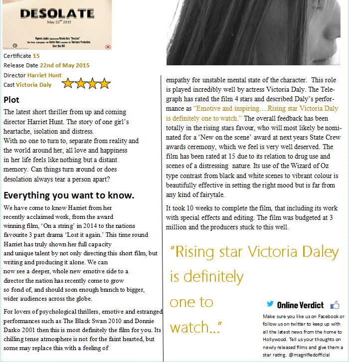
How effective is the combination of your main product and ancillary texts?
Photography Challenges
This is the photo used on my film poster, here the character has her hair tied up and out of the face completely. It is also clear that this photo was taken in bright natural light. The finished poster product is also used on the magazine article.
However, within the film itself all bathroom shots are completely different as the character is wearing clothing,with hair all down and covering some of the face. The lighting is also clearly different as the scene was filmed at night using artificial lighting in the bathroom.
This is a downfall as it does not tie in all 3 of my products correctly and although they are meant to work together as a collection for one end product it gives away a false image of what is expected. Instead I should have made sure all elements of photography gave a true honest reflection of my short film. Although this is a mistake on my part, I am happy with the effectiveness of both my poster shot and shots within the bath scene of the film. There is a large contrast made from the bright pure innocence of white light, to the dull pale grey shot in the film. This can show the difference between expectations and reality. We expect to see someone living a 'normal' life, surrounded by 'normal' people doing 'normal' day to day things, but audiences discover the reality is hard hitting, dull and not what anyone expects.


I feel that the writing within my film article is suitable in connection with my short film and poster. The 'Plot' is brief yet well written in describing the most important aspects of the short film. The use of a rhetorical question gives direct address to the reader and can advertises the mystery and intrigue surrounding the film.
Further in the article I have familiarised the film by relating it to other well known big name films and made the genre clear to attract my specified target audience. I have done this for all 3 in connection of the genre and making sure this vibe is forefront for audiences to understand.
This is the photo used on my film poster, here the character has her hair tied up and out of the face completely. It is also clear that this photo was taken in bright natural light. The finished poster product is also used on the magazine article.
However, within the film itself all bathroom shots are completely different as the character is wearing clothing,with hair all down and covering some of the face. The lighting is also clearly different as the scene was filmed at night using artificial lighting in the bathroom.
This is a downfall as it does not tie in all 3 of my products correctly and although they are meant to work together as a collection for one end product it gives away a false image of what is expected. Instead I should have made sure all elements of photography gave a true honest reflection of my short film. Although this is a mistake on my part, I am happy with the effectiveness of both my poster shot and shots within the bath scene of the film. There is a large contrast made from the bright pure innocence of white light, to the dull pale grey shot in the film. This can show the difference between expectations and reality. We expect to see someone living a 'normal' life, surrounded by 'normal' people doing 'normal' day to day things, but audiences discover the reality is hard hitting, dull and not what anyone expects.
I feel that the writing within my film article is suitable in connection with my short film and poster. The 'Plot' is brief yet well written in describing the most important aspects of the short film. The use of a rhetorical question gives direct address to the reader and can advertises the mystery and intrigue surrounding the film.
Further in the article I have familiarised the film by relating it to other well known big name films and made the genre clear to attract my specified target audience. I have done this for all 3 in connection of the genre and making sure this vibe is forefront for audiences to understand.
Monday, 23 March 2015
Tuesday, 17 March 2015
Thursday, 5 March 2015
My Poster
Photography
Throughout my research into film posters I found that I was already building an idea in my head as to what the expectations were for my final product when targeting my chosen target audience of young adult thriller lovers.
Checklist
- Some shadowing and darkness
- Close up of main character
- Relations to storyline (taken at one of the settings)
- Captivating and intriguing
- Well used photography with a relevant effective shot and angle
- Edited where and how is needed to enhance colour, lighting
- Give a professional finish
My initial idea for the main image of the poster was a front on take of the characters full face in the same place and position, I would have then edited so that the poster was split dead in the middle of her face, one side black and white and the other normal colouring. At the time I felt this split image would represent normality or a false front put on to the world compared with someone's real emotion and depression in the case of this character. However, after over thinking into the effectiveness of the shot I felt a front on shot using direct address was too cliché, as the majority of posters will do this as I have already found in my earlier research. I felt it also gave off the impression this character was open and confident when she is in fact quite and recluse.
Chosen shot analysis
 This medium shot is my chosen photo for my poster production to promote my short film. I am very satisfied by the outcome of the photo, the positioning of the camera was steady and straight as I leaned my arms on the side of the bath for stability and a clean level shot. I aided Lucy with her positioning and explained how I wanted the shot to look, this included a level head so the positioning of her head and jaw was straight and aligned rather than stooped and lazy looking. I also wanted her face to be relaxed and emotionless so there was no strain or creases on her face. I worked with Lucy's hair so that it was out of her face and up in a bun. I was also pleased with the spacing of Lucy's head and the rest of the bath because the black space of bath at the bottom is perfect for placing the title of the short film and other essential print within the strapline, such as quotes from magazines or release dates.
My wide research and planning into 'What lies beneath' was a clear inspiration for the shot. I found the use of the characters hand loosely hung over the bath, hid identity and also cast a tense and thrilling theme from the off set. Here I am similarly giving a sense of intrigue and slight frustration as to feeling the need to know who the person is as I have cropped just where the facial features begin.
Also in comparison with 'What lies beneath' is the small yet powerful uses of symbolism with colouring. The black nail varnish on the hand within the poster has a similar effect as the black earing worn at the top of Lucy's ear
Beginning to edit

In order for me to achieve the professional finish I aspire to achieve for my poster I began editing using http://www.fotor.com/
This was very useful in helping me create the professional clean cut finish picture I aspire to create. When using the 'Smoothing' option I could freely brush over any imperfections on Lucy's skin or even in the back drop of the photo to tidy it. The example photo shown to the right is evidence of my first attempt in smoothing the picture. I was happy with the effect itself as it dramatically improved the look from standard to professional finish. However when comparing the photo to the original product I found that my editing allowed for the picture to look false and too flawless. There was also mistakes made as the brush went over the line of where her skin ends and the blur is seen to overlap, making it look untidy and lazily edited.


When attempting to edit the second time it was far more successful and looked like a natural coverage over the skin, rather than an animated and false look. Now that this was complete I could progress onto editing colouring and lighting for the photo.
Other departments of the website enabled me to easily enhance the definition of the photo by experimenting with the brightness, contrast and temperature settings.
I edited in a way that would keep the original brightness and definition of the photo. Giving a clear open eye catching view of the full poster. The overall brightness of the photo can also represent the innocence and purity of her character.
The cream/tanned tint on the bath, background and skin of the character, helps to lesson the dull lifeless pale colouring and it is far more appealing and eye catching than the original photo.
My research into film posters helped me to plan and picture out the overall image I wanted for my final product as noted in my checklist. I realised the importance for certain conventions of the film poster, including
- Clear large title,
- Eye catching image and
- Vital information about the film including the main actors name, production company and producer/directors name usually in small writing spaced around the page
- Rating of film
I made sure these were included on the poster but made sure they were unique to my creative ability and the specific codes and conventions my short thriller should offer.
I thought up the name of a production company and introduced a simple yet effective brand image using 'Fonspace' for the professional bold print and used Google images for the animated clock relating to the 'Timelapse' theme. This institution name will also be used at the beginning of my film.
I felt by creating and using a quote given by the Telegraph can allow for the audience to have confidence and trust in an intelligent, knowledgeable perception of the film. This would be a largely helpful selling point by having faith in a comment made by an institution obviously well educated in the film industry and what it should offer audiences. Under this I have included the Telegraphs 4 star rating in bold black to stand out from the lightly lit backdrop.
I feel happy with where I placed the quote, Telegraph logo and star ratings as it seems to fit well in filling an empty space contained in the mise en scene of the photo. The size and positioning of this is also well structured and I am confident that this looks professional and fits well for my poster.
Tuesday, 10 February 2015
Poster Analysis


This is a screen shot taken from Google images as the most popular results when searching for 'Thriller film posters.' I have watched the majority of the films depicted here which is useful in helping me understand the posters more and the relevance they have in targeting an audience and showing off the film to its full potential without revealing too much of the plot.
Black is very overpowering and predominant at first glance here. Many of the posters have pictures edited onto all black backdrops, I find that is is useful in proving the film casts darkness and is not for the light hearted, it is also useful in emphasising what is on top of the background (a face or a number of characters) as this will now stand out of the contrasting dark back drop.
This research has also emphasised the popularity of using close ups of the main characters face portraying serious emotionless expressions, keeping eye contact with the audience this form of advertising makes good use of a direct mode of address. This is a highly useful selling point when advertising any product, from magazines and leaflets to film and CD album covers.
This serious staring expression will massively single out a target audience of age 15-18 or older and those who enjoy dramatic, emotive, thrilling performances. As from this it is already clear this is not a film of comedy, romance or child like fiction.
Every one of the pictures used above are flawlessly photographed and highly edited to give the best impacting shot they can create.
Friday, 6 February 2015
Storyboarding
Narration/Speech
I feel that no narration or speech of any kind is best to fit with the effect I am going for within my storyline. Although this is an important feature of a film I feel that silence speaks more emotion in these circumstances than any words could and this will be a large aid in building mystery, tension and emotion. Because this film will only be minutes long I feel there is not a real need of in depth explanation in to a story by a character/narrator, its aim is to impact and give a message/ moral or thrill for a shot space of time.
Props
Clothes - I will supply Lucy with dark casual clothes I see most suitable to wear in the film, this will help reflect the mood she is in. Hooded tops so she can wear her hood up whenever outside. This will show how she wishes to exclude herself from the rest of the world, and show how enclosed her personality is by walking with her head down and back hunched.
When inside I will supply Lucy with black loose fitting clothes
Phone and Earphones- I will give Lucy my Iphone and earphones to use in the appropriate scenes, it is necessary to use an I phone as the large surface area on the touch screen allows whatever is on the screen to be easily viewed on camera. I plan to use the phone in scenes where she may text someone and have no reply to emphasise how lonely she is, and perhaps scroll through photos depicting happy memories that she once had also emphasising the loss of happiness in contrast with the life she once had. I may use the earphones in scenes where she is walking alone and later edit sad slow music to reflect her mood.
Location
The story will take place within home settings, mainly the bathroom and bedroom. As well as fields, country parks and forests where I will have scenes of Lucy walking, collecting her thoughts and having alone time. As well as showing Lucy's emotion and isolation it will be useful to have beautiful scenery shots of sunshine and birds singing to cast contrast over Lucy's sadness in comparison with the peaceful beauty in the world around her.

Actors
My film is totally based around the breakdown in a persons life and how loneliness, mental health issues and stress can eat someone up. Because this is so personal I want to restrict the film to 1 actor so all attention is hers and there is no distraction. Adding another character could take the attention away from Lucy's struggle and this is the whole focus of the film.
Although other people will be seen on photos or on her phone these only pose as memories and signify important memories that make her who she was and what she has become. These people only pose as pieces in the puzzle of why she now is so alone and depressed, and it is up to the vivid imaginations of the audience to put together what they believe to be her story.
Sound
I hope to edit music on top of certain scenes where the character will have headphones in and walk listening to her songs. I have found music to be incredibly powerful for creating emotion or reflecting someone's mood, in and out of film. The genre of song will usually fit the emotions of the listener as a source of comfort, and similarly to film it gives a sense of release or escapism and this is very important. I have always had a large interest in soundtracks and songs used in films and I feel that without them our most loved scenes in classic films would not be the same.
For Lucy's character this is essential as she is so uncomfortable with who she is, slow/meaningful songs that have lyrics she can relate to played only to her will draw her away from reality even more so than she already is.
I have songs in mind when envisioning the film, examples such as slow typical wreckless youth songs that are often used in teenage films from 80's to present day. These can vary from slow unique eerie sounds to contrasting upbeat passes with emotive lyrics.
Example

https://www.youtube.com/watch?v=9_eUyo8aWTQ
In the opening scenes of Donnie Darko, it begins with the camera following a road overlooking a remote urban area and someone yet unknown lying in the middle of the road. The lightening would suggest it is in the early hours of the morning as there is little light, only casting from the distance. There is silence now, only for a constant calm ringing sound creating an echo to suggest remoteness, loneliness and some tension.As the camera creeps closer we see the character start to rise from the ground. Just as this occurs a soft majestic piano sequence begins, to me this automatically gives importance of the life of this character as he moves letting the audience know that he is alive as some may have assumed it is a body on a road from the earlier silence and stillness and tense music.
The camera is constantly moving getting closer to and surrounding the character slowly circling him until we come to know his face and identify him.
Just as the title of the film is viewed the scenes jumps cuts to Donnie riding a bike, this now takes the audience into another mood and is put at ease as a tune starts to play. This is 'The killing moon' by Echo and the Bunnymen, as the scene and with it the song progresses, the haunting singing and low tuned sounds of the song give a alternative post punk vibe, fitting with teen culture of the early 90's.
Although the song is fast passed the emotive lyrics change the vibe. I find that this is a clever use of music in film and take it as inspiration as a feature I wish to ad to my final product.
However I may struggle to settle on one as most of the songs I would contemplate are copyright and this creates an issue for editing.
I feel that no narration or speech of any kind is best to fit with the effect I am going for within my storyline. Although this is an important feature of a film I feel that silence speaks more emotion in these circumstances than any words could and this will be a large aid in building mystery, tension and emotion. Because this film will only be minutes long I feel there is not a real need of in depth explanation in to a story by a character/narrator, its aim is to impact and give a message/ moral or thrill for a shot space of time.
Props
Clothes - I will supply Lucy with dark casual clothes I see most suitable to wear in the film, this will help reflect the mood she is in. Hooded tops so she can wear her hood up whenever outside. This will show how she wishes to exclude herself from the rest of the world, and show how enclosed her personality is by walking with her head down and back hunched.
When inside I will supply Lucy with black loose fitting clothes
Phone and Earphones- I will give Lucy my Iphone and earphones to use in the appropriate scenes, it is necessary to use an I phone as the large surface area on the touch screen allows whatever is on the screen to be easily viewed on camera. I plan to use the phone in scenes where she may text someone and have no reply to emphasise how lonely she is, and perhaps scroll through photos depicting happy memories that she once had also emphasising the loss of happiness in contrast with the life she once had. I may use the earphones in scenes where she is walking alone and later edit sad slow music to reflect her mood.
Location
The story will take place within home settings, mainly the bathroom and bedroom. As well as fields, country parks and forests where I will have scenes of Lucy walking, collecting her thoughts and having alone time. As well as showing Lucy's emotion and isolation it will be useful to have beautiful scenery shots of sunshine and birds singing to cast contrast over Lucy's sadness in comparison with the peaceful beauty in the world around her.
Actors
My film is totally based around the breakdown in a persons life and how loneliness, mental health issues and stress can eat someone up. Because this is so personal I want to restrict the film to 1 actor so all attention is hers and there is no distraction. Adding another character could take the attention away from Lucy's struggle and this is the whole focus of the film.
Although other people will be seen on photos or on her phone these only pose as memories and signify important memories that make her who she was and what she has become. These people only pose as pieces in the puzzle of why she now is so alone and depressed, and it is up to the vivid imaginations of the audience to put together what they believe to be her story.
Sound
I hope to edit music on top of certain scenes where the character will have headphones in and walk listening to her songs. I have found music to be incredibly powerful for creating emotion or reflecting someone's mood, in and out of film. The genre of song will usually fit the emotions of the listener as a source of comfort, and similarly to film it gives a sense of release or escapism and this is very important. I have always had a large interest in soundtracks and songs used in films and I feel that without them our most loved scenes in classic films would not be the same.
For Lucy's character this is essential as she is so uncomfortable with who she is, slow/meaningful songs that have lyrics she can relate to played only to her will draw her away from reality even more so than she already is.
I have songs in mind when envisioning the film, examples such as slow typical wreckless youth songs that are often used in teenage films from 80's to present day. These can vary from slow unique eerie sounds to contrasting upbeat passes with emotive lyrics.
Example
https://www.youtube.com/watch?v=9_eUyo8aWTQ
In the opening scenes of Donnie Darko, it begins with the camera following a road overlooking a remote urban area and someone yet unknown lying in the middle of the road. The lightening would suggest it is in the early hours of the morning as there is little light, only casting from the distance. There is silence now, only for a constant calm ringing sound creating an echo to suggest remoteness, loneliness and some tension.As the camera creeps closer we see the character start to rise from the ground. Just as this occurs a soft majestic piano sequence begins, to me this automatically gives importance of the life of this character as he moves letting the audience know that he is alive as some may have assumed it is a body on a road from the earlier silence and stillness and tense music.
The camera is constantly moving getting closer to and surrounding the character slowly circling him until we come to know his face and identify him.
Just as the title of the film is viewed the scenes jumps cuts to Donnie riding a bike, this now takes the audience into another mood and is put at ease as a tune starts to play. This is 'The killing moon' by Echo and the Bunnymen, as the scene and with it the song progresses, the haunting singing and low tuned sounds of the song give a alternative post punk vibe, fitting with teen culture of the early 90's.
Although the song is fast passed the emotive lyrics change the vibe. I find that this is a clever use of music in film and take it as inspiration as a feature I wish to ad to my final product.
However I may struggle to settle on one as most of the songs I would contemplate are copyright and this creates an issue for editing.
Monday, 19 January 2015
Research and Inspiration - What lies beneath analysis
What lies beneath
Characters Norman and Claire Spencer are a seemingly happily married couple, until they uncover a terrible secret that leads Norman to use a paralysing drug on Claire and leaves her with the bath running to drown looking like suicide. The shots during this climactic scene are varied with dramatic effects.
 https://www.youtube.com/watch?v=irr4b40Ok7E&list=PL84629EA1FA286907&src_vid=vPTTP3gSLJc&feature=iv&annotation_id=annotation_990866


These two shots run through 10 second intervals and are very effective in showing the full scale of the situation. This birds eye view follows the characters as the paralysed victim is taken and set up as though they are committing suicide. The majority of high shots are used in order to cower over characters that are being made to feel insignificant, small or threatened. In this case, it is effective for showing a full view of the main most important character of the scene, the victim.
The shot is very powerful in terms of mise en scene, in that it establishes a full shot of the setting for the evidently climactic events, and gives it importance, making the audience want to now focus and be fully involved in the tension. It gives visual aids as to what could happen next, and by gradually feeding more and more knowledge to the audience as the climactic tension increases.
The lightly coloured nude and white clothes worn by character 'Claire' help to connotate even more the innocence and angelic nature of the victim.

The lighting here is very effective in its casting contrast between the walk way the character takes into the bathroom. This could emphasise even more the importance of the setting and what it is about to unfold as the character walks from the dark shadows into a bright white lit room.
Having the limp lifeless hand hanging at the top of the shot creates a much more chilling atmosphere, as well as the dark coloured clothing of the male.

This is a perspective shot, taken as if the camera is the eyes of the victim (Michelle Pfeiffer,) this is very effective in giving a sense of realism, connecting the audience to the character by giving you her view of what is happening. The stillness of the shot acting as her head is effective in emphasising her loss of movement and vulnerability in comparison to the fast flowing tap and rippling water, the rushing water is all you can hear throughout the shot, it is common within tense, thrilling scenes such as this to have the perspective shot with heavy breathing or a strong racing heart beat edited in. However this scene again highlights the paralysis and vulnerability of the character by having silence because her breathing is decreased.

The shot then swaps to view a close up on her face at a low level as if the camera is floating on the water, this is effective in giving the scene a sense of realism as the audience is there in the bath with her. The use of a close up shows the full horror and fear her face expresses, as the face is frowned slightly and eyes filled with tears.
Characters Norman and Claire Spencer are a seemingly happily married couple, until they uncover a terrible secret that leads Norman to use a paralysing drug on Claire and leaves her with the bath running to drown looking like suicide. The shots during this climactic scene are varied with dramatic effects.
These two shots run through 10 second intervals and are very effective in showing the full scale of the situation. This birds eye view follows the characters as the paralysed victim is taken and set up as though they are committing suicide. The majority of high shots are used in order to cower over characters that are being made to feel insignificant, small or threatened. In this case, it is effective for showing a full view of the main most important character of the scene, the victim.
The shot is very powerful in terms of mise en scene, in that it establishes a full shot of the setting for the evidently climactic events, and gives it importance, making the audience want to now focus and be fully involved in the tension. It gives visual aids as to what could happen next, and by gradually feeding more and more knowledge to the audience as the climactic tension increases.
The lightly coloured nude and white clothes worn by character 'Claire' help to connotate even more the innocence and angelic nature of the victim.
The lighting here is very effective in its casting contrast between the walk way the character takes into the bathroom. This could emphasise even more the importance of the setting and what it is about to unfold as the character walks from the dark shadows into a bright white lit room.
Having the limp lifeless hand hanging at the top of the shot creates a much more chilling atmosphere, as well as the dark coloured clothing of the male.
This is a perspective shot, taken as if the camera is the eyes of the victim (Michelle Pfeiffer,) this is very effective in giving a sense of realism, connecting the audience to the character by giving you her view of what is happening. The stillness of the shot acting as her head is effective in emphasising her loss of movement and vulnerability in comparison to the fast flowing tap and rippling water, the rushing water is all you can hear throughout the shot, it is common within tense, thrilling scenes such as this to have the perspective shot with heavy breathing or a strong racing heart beat edited in. However this scene again highlights the paralysis and vulnerability of the character by having silence because her breathing is decreased.
The shot then swaps to view a close up on her face at a low level as if the camera is floating on the water, this is effective in giving the scene a sense of realism as the audience is there in the bath with her. The use of a close up shows the full horror and fear her face expresses, as the face is frowned slightly and eyes filled with tears.
Subscribe to:
Posts (Atom)